Continuing a series of KendoUI widgets (this and this)… This one allows you to mark as selected HTML objects and then ask for which one are actually selected.
As per se, this is not a lot but this is actually used by another widgets and you can find it useful as well.
KendoUI: selectable widget
Selectable widget: source code
/*
 * Copyright (c) 2012. OnaBai Software Solutions.  All rights reserved.
 * If you do not own a commercial license, this file shall be governed by the
 * GNU General Public License (GPL) version 3.
 * For GPL requirements, please review: http://www.gnu.org/copyleft/gpl.html
 */

(function ($) {
    var kendo = window.kendo,
        ui = kendo.ui,
        Widget = ui.Widget,
        CLICK = "click";

    var OBSelectable = Widget.extend({
        init       :function (element, options) {
            var that = this;

            Widget.fn.init.call(that, element, options);
            element = that.element;
            options = that.options;
            var items;
            if (options.selector) {
                items = $(options.selector, that.element);
            } else {
                items = element.children();
            }
            items.bind(CLICK, $.proxy(that._click, that));
        },
        getSelected:function () {
            return $(".ob-selected", this.element);
        },
        options    :{
            name    :"OBSelectable",
            style   :"ob-status-selected",
            multiple:true,
            selector:null
        },
        events     :[
            CLICK
        ],
        _click     :function (ev) {
            if (!this.options.multiple) {
                this.getSelected().removeClass(this.options.style + " ob-selected");
            }
            $(ev.currentTarget).toggleClass(this.options.style + " ob-selected");
        }
    });
    ui.plugin(OBSelectable);
})(jQuery);
Selectable widget: usage
One element is selected by clicking on it, if you click on a selected element, then it is de-selected.
Selectable widget: configuration
style (string, default: ob-status-selected): Style (CSS class) applied to selected elements (clicked).
multiple (boolean, default: true): When true, you might select more than one item, otherwise selecting an item will cause the de-selection of any selected one.
selector: (string, default first level child nodes). If configured, selector allows you to mark as selectable nodes that are not the direct children of this.
Selectable widget: methods
getSelected: Returns list containing the elements that are marked as selected.
Selectable widget: usage example
The HTML:
<ol id="selectable">
    <li class="ob-item">Element 1</li>
    <li class="ob-item">Element 2</li>
    <li class="ob-item">Element 3</li>
    <li class="ob-item">Element 4</li>
    <li class="ob-item">Element 5</li>
</ol>
The JavaScript:
$("#selectable").kendoOBSelectable({
    selector:"[class='ob-item']",
    style:"selected",
    multiple:true
});
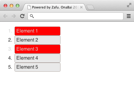
I define as selectable those node under the node with id selectable and with class ob-item. This would have been equivalent to say selector:”li” or not defining selector since all li elements area actually first level children of $(“#selectable”).
If I define the selected CSS class as:
.ob-selected {
    background-color: red !important;
    color: #d3d3d3 !important;
}
I get something like this when Element 1 and Element 3 are selected:
