Many times we have much more information to show in a Grid than what is physically possible. For those cases KendoUI provides a mechanism through an option in Grid initialization called detailTemplate.
In this post I will show you how to use, the standard way but also how to show that same detailed information not inside the grid but in a tooltip displayed when mouse is over a row.
KendoUI: detailTemplate
Once again KendoUI engineers have read our minds and thought about our needs, implementing a feature for showing detailed information.
The idea behind is defining a template that will be displayed inside the Grid (as an expanded row of the original one) including the details (or -actually- whatever you want to include).
This is our DataSource:
var dataSource = new kendo.data.DataSource({
    data    : [
        { symbol: "AAPL", company: "Apple Inc.", price: 509.5892 },
        { symbol: "AMZN", company: "Amazon.com Inc.", price: 245.18  },
        { symbol: "IBM", company: "International Business Machines Corp.", price: 189.83 },
        { symbol: "CSCO", company: "Cisco Systems, Inc", price: 19.4494 },
        { symbol: "MSFT", company: "Microsoft Corp.", price: 26.55 },
        { symbol: "INTC", company: "Intel Corp.", price: 20.23 },
        { symbol: "QCOM", company: "QUALCOMM Inc.", price: 60.6382 },
        { symbol: "ORCL", company: "Oracle Corp.", price: 33.02 },
        { symbol: "HPQ", company: "Hewlett-Packard Company", price: 13.68 },
        { symbol: "CRM", company: "salesforce.com, Inc.", price: 164.18 }
    ],
    pageSize: 5
});
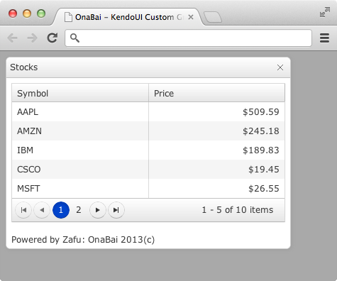
and we want to show in the Grid just the symbol and price (but not company).
This is our Grid initialization:
var grid = $("#stocks_tbl").kendoGrid({
    dataSource    : dataSource,
    columns       : [
        { field: "symbol", title: "Symbol", width: 100 },
        { field: "price", title: "Price", width: 100, format: "{0:c2}", attributes: {style: "text-align:right;"} }
    ],
    pageable      : true
}).data("kendoGrid");
That looks like this:
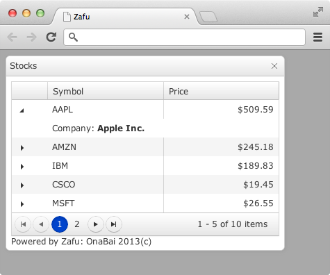
But, I’d like to show the details, in this example, the company name. So, what I do is define a template that displays this additional information.
This template is something like:
<script id="template" type="text/x-kendo-template">
<div>Company: <span style="font-weight: bold;">#= company #</span></div>
</script>
And when the row is expanded it looks like:
Display details in a tooltip
That’s ok but I have to click to open the details and in some case I just want to display it as a tooltip. In those case what I’m going to do is something similar (define a template) but instead of displaying it inside the Grid table, I’m going to show it as a tooltip.
The very first thing is defining an HTML block on which we I’m going to display the detailed information.
<div class="k-tooltip ob-hidden" id="tooltip" data-template="template" data-bind="source: this"></div>
Where ob-hidden is defined as:
.ob-hidden {
    display: none;
}
Used for hiding the tooltip.
Then in the JavaScript I’m going to display this tooltip when the mouse is over a grid row and hide it when it exits.
    // Show tooltip when mouse is over a row
    $(grid.element).on("mouseover", "tr", function() {
        $("#tooltip").removeClass("ob-hidden");
    });
    // Hide tooltip when mouse exits a row
    $(grid.element).on("mouseout", "tr", function() {
        $("#tooltip").addClass("ob-hidden");
    });
In addition, when I’m about to display the tooltip, I have to bind the row data to the template and that’s why I have include data-bind=”source: this” in the tooltip definition:
$(grid.element).on("mouseover", "tr", function () {
    // Get the item from the grid
    var item = grid.dataItem(this);
    if (item) {
        // Bind it to the tooltip
        kendo.bind("#tooltip", item);
        // Make tooltip visible
        $("#tooltip").removeClass("ob-hidden");
    }
});
Right now, the tooltip looks like:
Where the tooltip is displayed always in the same position and far from where the cursor is. So the final question would be displaying the tooltip near the cursor.
In this case and for a more precise tooltip position, what I’m going to do is replace the mouseover by a mousemove, this means much more work but the tooltip will follow very precisely the mouse.
The new code for display the tooltip will be:
// Show tooltip when mouse moves over a row
$(grid.element).on("mousemove", "tr", function (e) {
    var item = { item: grid.dataItem(this) };
    if (item.item) {
        kendo.bind("#tooltip", item);
        $("#tooltip")
                .css({top: e.pageY + 5, left: e.pageX + 5})
                .removeClass("ob-hidden");
    }
});
Where I get the position of the cursor from the event argument of the mousemove handler.
And this looks like:
 Document workflow using CouchDB & HTML5
This example was wonderful … Really helped me lot.. Many thanks…