In my previous post I introduced you to the new feature on how to export the grid to PDF, even some of the options. Now I will cover some more advanced features linked to the new setOptions improved in this same KendoUI 2014 Q3 release.
Kendo UI Grid: advanced features
Shall I need to have the “Export to PDF” defined as a button in the toolbar
No, of course not. Telerik engineers though on that and the same function that is invoked when you click the toolbar button, can be invoked programmatically from your code. You just need to invoke saveAsPDF method on the grid.
Many interesting new features in KendoUI Q3 2014 and many related with KendoUI Grid. Following my previous post on Multi-header grids, I will cover a second new functionality: export to PDF.
KendoUI Grid export to PDF
How many times did you want to get your table / grid saved as PDF file? and what about if you don’t have to write any code neither in the server nor in the browser? That’s what we get in KendoUI 2014 Q3 and the very best, it is as simple as add a button to the toolbar.
Defining the Export to PDF button
Defining a toolbar is as simple as adding toolbar and an array of strings identifying the commands. Previous releases support built-in commands as create, save, sync… Now we have also pdf for exporting the table with the same filters, sorting order, groupings… that we have in screen.
But there are more options that you can define as Author, Date, File Name, Keywords, landscape (true or false), margin or even Paper Size. This is as simple as:
Many interesting new features in KendoUI Q3 2014 and many related with KendoUI Grid. I’ll be writing about some of them in the next posts including:
Export to PDF
Export to CSV
New TreeList widget (despite this is a tree, it might be considered as nested grids)
and the first of these post series multi-column headers
KendoUI Grid Multi-Column headers
This is something that has been requested for a long time and is the capacity of having multiple columns in a Grid under the same title or having multiple levels of titles. The same thing that you do in Excel when you merge several header cells.
Excel with merged header cells
In KendoUI, you had to live without merging cells and get one level headers (one header for each column).
KendoUI Grid with simple headers
But with KendoUI Q3 2014, you can also get the same effect by defining inside a column an array of columns. An idea really neat and transparent for previous definition syntax (backwards compatible).
Defining multi-columns
The definition of simple headers is an array of columns:
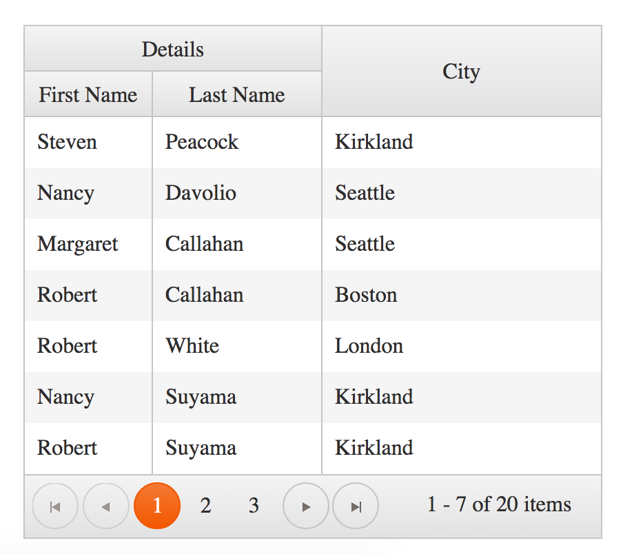
With this simple extension and minimum code change, I’ve been able to group FirstName and LastName columns under a Details header getting:
KendoUI Grid with merged headers
Really simple and very userful: Thanks Telerik!
Note: As you can see the structure of the data in the DataSource is the same than for simple headers, one question is the presentation where First and Last Name are grouped under Details and another is the Data Model where we do not have such grouping.
If this is not the first time that you read my posts, you probably know that I actively participate in StackOverflow and you probably have already gone through some post where I write about some question that I think that deserves a little more information.
Few days back someone asked how (if possible at all) to get both popup and inline editing in the same grid. Basically what he was trying to do is using popup when creating a new record and use inline (or incell) for existing records. We might argue if from a standard UX point of view if this is good but I can see some cases where this might make sense so I’ve decided to investigate a little on it and I’ve tried to answer the question.
Mixing popup and inline editing in a grid
Research
The very first thing that I thought about was trying to invoke directly the functions that creates the popup window form for editing a record and the function that switches into inline (or incell) mode. The idea was if I can invoke the internal methods directly, I would be able to trigger the mode that I want defining custom buttons.
But when examining KendoUI code (yes, it’s is not Open Source but as Telerik Most Valuable Professional I have access to it) I see that I need to send extra arguments to the methods for popup and incell and it was not easy (clean) for me getting these arguments.
Second approach was invoking KendoUI Grid addRow method that enters in edit mode and depending on the initialization value, it is going to be “popup” or “inline”. The question was … if I change the edition mode dynamically and not at initialization time, will it be used?
The answer is yes, you can change the option dynamically and next time edit event is triggered the edition mode will change. This is not the case with some options for this and other Kendo UI Widget that once the widget is created, they will not read back the options.
How to implement it
What I had to do is:
Initialize the Grid for using, by default, inline mode.
Define a Custom button in the toolbar that looks like the standard “Add new row” but executes our own code.
Define the button handler that forces the edition mode to “popup”, invokes editRow and restores previous edition mode (“inline”)
This would be something like
var grid = $("#grid").kendoGrid({
    dataSource: ds,
    toolbar: [
        {
            // My own version of "Add new record" button, with name **popup**
            text : "Add new record",
            name: "popup",
            iconClass: "k-icon k-add"
        }
    ],
    // By default is **inline**
    editable: "inline",
    ...
}).data("kendoGrid");
Here we can see that I’ve created in the toolbar a button with name “popup” and showing the text “Add new record”, the same being displayed by the default “create” button. Finally, I’ve define the icon that should be displayed in the button having the button look exactly the same than the standard “create” button.
The second important question is that I’ve defined “editable” as “inline” so it is expected that I define an “edit” button for each row and when clicked, it enters in “inline” edition.
Now, the missing part: attach a click event handler attached to my “popup” button. This is:
// Event handler for my **popup** button defined in the grid toolbar
$(".k-grid-popup", grid.element).on("click", function () {
    // Temporarily set editable to "popup"
    grid.options.editable = "popup";
    // Insert row
    grid.addRow();
    // Revert editable to inline
    grid.options.editable = "inline";
});
Binding a function to the click event for buttons defined in the toolbar is defining using “on” jQuery method for the CSS class “.k-grid-” in our case since “name” is equal to toolbar, we use the CSS “.k-grid-popup”.
As you can see is a pretty simple process, pretty clean and you don’t have to do a lot of code edition or source code change.
Today KendoUI announced its new release KendoUI Professional Q2 2014 and during the video presentation they have shown the new Widget ContextMenu.
Despite of attending the presentation I did want to play with it and learn more about this Widget. What is the best way for quickly getting familiar with Kendo UI Widgets? Yes, you are right, their Demo web sitebut there is no demo about this widget, is that possible? Sure they will fix it pretty soon.
A context menu (also called contextual, shortcut, and popup or pop-up menu) is a menu in a graphical user interface (GUI) that appears upon user interaction, such as a right-click mouse operation.
What is a ContextMenu for Kendo UI?
For Kendo UI is an HTML unordered list (pre) that might happen to have more than one level (another unordered list).
In the previous paragraphs I have shown how to define the content of the Context Menu but we should say which are the target elements on which this Context Menu is activated. To do so, you define in the initialization the target elements using a jQuery Selector.
Here I define that the context menu is going to be displayed if you right-click on an HTML element which id is “area1” or “area2”. Any other part of your HTML will not display it.
Defining a ContextMenu as DataSource
Despite I’ve shown how to initialize the content of the Context Menu using an HTML unordered list (ul) you can also use a DataSource or an array as follow:
Where each option is an entry in the array and nested option are nested elements stored in an array called “items”.
Since this context menu is actually not defined in HTML I’ve used “$(‘
‘).kendoContextMenu({…});” for creating an HTML element that will contain the menu.
Additional options for the menu items
I’ve shown how to just display a text but you can actually decorate the text using any HTML by doing:
{ text: "United States", encoded: false },
Here I’ve decorated the text as bold (b) and I have set “encoded” to “false” indicating that “<” and “>” should actually not be displayed as a character but being part of the HTML tag.
The following image shows what happen if I define the content of the context menu as:
The new Context Menu widget actually is pretty similar to Kendo UI Menu, it accepts most of the Menu options and the DataSource are reusable as well. This is how the Menu looks like if I use previous DataSource for defining a Menu.
Today, just few minutes back, Telerik has announced their new version of KendoUI: Q2’2014. Some new widgets, features and AngularJS framework integrated in the official code.
In this release there are some very powerful widgets, actually I do consider them as full applications more than just simple widgets. Focusing in Kendo UI Web we find the following new Widgets:
Pivot Grid, see demo here, with functionality similar to the one that you can find in Microsoft Excel and very useful for analyzing data in a numeric way.
Gant, see demo here, with functionality similar to Microsoft Plan Project, and good for displaying project status.
And, my favorite one, ToolBar, see demo here. A ToolBar similar to the one that you can find in Editor Widget and something that we missed for a long time.
Toolbar
Kendo UI new ToolBar widget includes the following features:
Button: regular button that might include an icon, a text or both.
Button Group: set of buttons rendered together (no space between buttons)
Split Button: a button that include a text plus a drop down menu with more buttons.
Separator: separate a group of buttons by a vertical bar.
If it does not fit in your screen it includes an overflow button with the hidden buttons.
Defining a toolbar
A toolbar is basically an array of items where each item is a Button, a Button Group, a Split Button or a Separator. When the element is a Button Group, then it will include the different buttons that compose the group.
A “type” that indicates the type of element. Supported types are “button”, “splitButton”, “buttonGroup”, “separator”.
A “text” the displayed text in the button. If not defined there is no text (only icon).
An “icon” the displayed icon in the button. If not defined there is no icon (only text).
It might also include other properties as “id” (assign a unique identifier to the button), “click” event handler that will execute when the button is clicked.
Defining a button group is as simple as defining a button.
One of the new widgets just introduced in Kendo UI is kendoMaskedTextBox. This is something that we have been waiting for long time… no need to keep waiting. We can start today enjoying it. Let’s see how.
Introduction to KendoUI MaskedTextBox
What is a maked input field? Their definition: Define and restrict the data to be entered in an html input field.
Let me show it with an example, you have to define an input field and you want to control that what the user types follows some specific format (v.g. telephone number, credit card number, date…) so you are implicitly defining some validation rules. Both the user types it with the format that you want and it gets displayed with the correct format.
kendoMaskedTextBox: Defining a mask for a phone number
In my country, the telephone number are 9 digits and you typically have them in the format 999-999-999. So I want to define an input fields that only allows me to type phones so they have to be all digits and as soon as you finish a group of three the cursor moves to the next group.
Where I define that the input supports 4 characters which mask rule is an e and then I define what e means by defining a rule that says that e might be a digit in the group 02468.
But the rule might even be a function. So this can also be implemented as:
This is important to note. In widgets as KendoDateTimePicker when you initialize the widget with an invalid date, this is displayed as it is until you edit the field.
Example: I initialize the DatePicker to February 29th, 2014 but this day does not exist. What we see is:
And when we enter in edition mode we get:
But, kendoMaskedTextBox works in a different way, the characters defined in the initialization are like typed by you and those that do not met the rule restriction are simply ignored.
So if we define a value of 12345678 for our 4 even digits mask, what we will get is:
That shows that the date that we used during the initialization is just ignored.
kendoMaskedTextBox: Still some features missing
This is actually a great widget. The only limitation that I’ve found is that masks do not support repeating factor something like saying that a number repeated seven times (something like 9(3) meaning that a digit between 0 and 9 repeated 3 times) or that some character mask should be typed between n and m times (something like 9(1..3) meaning that a number between 0 and 9 repeated between 1 and 3 times).
Telerik just announced their KendoUI Q1’14 Release and this time they bring a lot of cool new widget and some very interesting new options for old ones.
In this post I will list some of this cool options that I’ve already been able to test while in Beta and now I can enjoy in its full flavor.
New Widgets
There are some cool and very nice widget as:
Notification: Very easy and non blocking notifications for your sites. Forget about alerts or have to handcraft popup windows. They provide you new notifications even with custom categories (not just warning and errors) and you can choose where to display them (top, bottom, left, right, fixed position, contained, floating…), for how long (they can autohide after some period of time), they can be templated,…
MaskedTextBox: This is likely my favorite one because of the long time waited. Yes, you can finally have masked text box for telephones, credit cards, or you can even create your own. This actually deserves a post by itself that I’m already writing.
Sortable: This is actually a widget per se but it is also used in Grid were you can move rows and sort them. Really nice effect!!!
“Real-time” DataSource: Wow!!! this is also cool. Have two grids, listviews… and see what you do in one being updated in the other. Do you remember what I did with Dropbox in the post ? Now you have the same effect with plain KendoUI. This is a new level of Observable Objects
Grid Frozen Columns: another new options for making Kendo UI Grids even better. Now you might have some columns stick where they are when you scroll horizontally. Perfect when you have large amount of data or even better when your screen size is not that large.
Please, go to their demo web site and see them in action. It’s worthy.
The WordPress.com stats helper monkeys prepared a 2013 annual report for this blog.
Here’s an excerpt:
The Louvre Museum has 8.5 million visitors per year. This blog was viewed about 70,000 times in 2013. If it were an exhibit at the Louvre Museum, it would take about 3 days for that many people to see it.
Today I got a question where someone wanted to use KendoUI AutoComplete but wanted it to look like a KendoUI MultiSelect. When I wonder why he/she wanted to use an AutoComplete the only reason was because the list of elements was huge. So, why not using Server Side Filtering in a MultiSelect?.
KendoUI Server Side Filtering
When you need to manage a large list of elements the solution doing some filtering in the server and just transfer a few of them.
The advantages of this are multiple:
Save bandwidth sending only few elements
Do not render an HTML element for each element returned
Save memory due to less DOM elements
Save memory due to a smaller KendoUI DataSource
Increase performance do to a smaller DOM
…
So why not always using Server Side Filtering? Sometimes the fact of going back and forth getting new elements is not worthy for a small list of elements and this increases the complexity in the server that needs to deal with filtering.
Think about the number of elements and how they are going to be displayed in screen, if there is no good reason for having all pre-loaded, try doing it in the server.
KendoUI MultiSelect with server side filtering: MySQL table structure
This example will show a KendoUI MultiSelect that allows to choose countries from a MySQL database.
The structure of the countries table in MySQL is:
mysql> desc countries;
+-------+---------------+------+-----+---------+-------+
| Field | Type          | Null | Key | Default | Extra |
+-------+---------------+------+-----+---------+-------+
| id    | decimal(10,0) | NO   | PRI | NULL    |       |
| name  | varchar(128)  | NO   |     | NULL    |       |
+-------+---------------+------+-----+---------+-------+
2 rows in set (0,00 sec)

mysql>
And one sample of the content is:
mysql> select * from countries order by name limit 10;
+----+---------------------+
| id | name                |
+----+---------------------+
|  0 | Afghanistan         |
|  2 | Albania             |
|  3 | Algeria             |
|  4 | American Samoa      |
|  5 | Andorra             |
|  6 | Angola              |
|  7 | Anguilla            |
|  8 | Antarctica          |
|  9 | Antigua and Barbuda |
| 10 | Argentina           |
+----+---------------------+
10 rows in set (0,00 sec)

mysql>
KendoUI MultiSelect with server side filtering: PHP select code
The PHP code for selecting the elements is:
<?php
// Create connection to the database
// db server:  127.0.0.1 (localhost)
// db user: so
// db password : password
// db name : so
$con = mysqli_connect("127.0.0.1", "so", "password", "so");

// Initialize the list of countries to return
$countries = [];
// Check that we actually get a filter condition
if ($_GET && $_GET['filter']['filters'][0]) {
    // Get the value
    // NOTE: We are not checking other fields in filter since autocomplete will
    //       always send it as "starts with" and ignore case.
    $filter = $_GET['filter']['filters'][0]['value'];
    $where  = "where name like '" . $filter . "%' ";
}
else {
    // Did not get filter, do not build a where clause
    $where = "";
}
// Query MySQL and limit the list of results to 5
$result = mysqli_query($con, "SELECT name FROM countries " . $where . " order by 'name' limit 5");

// Build the array of results
while ($row = mysqli_fetch_array($result)) {
    array_push($countries, array("name" => $row['name']));
}
mysqli_close($con);

// Return it as JSON
header("Content-type: application/json");
echo json_encode($countries);
?>
KendoUI MultiSelect with server side filtering: JavaScript
And finally the MultiSelect definition:
// DataSource where the read URL is the PHP code above
var ds = new kendo.data.DataSource({
    transport      : {
        read: "select.php"
    },
    // Server Side Filtering
    serverFiltering: true
});

// MultiSelect Widget initialization
$("#items").kendoMultiSelect({
    dataValueField: "name",
    dataTextField : "name",
    dataSource    : ds
});


 Document workflow using CouchDB & HTML5